Martin Aitchison, died this week at the age of 96. You might not know his name, but if you are reading this post, there’s a good chance you remember some of his illustrations for Ladybird Books.
 |
| Some of the Ladybird Books Martin illustrated for Ladybird |
Until this week I used to describe him as “the last of the great, golden-age Ladybird artists still with us”. I knew him personally and called him a friend.
You can read
biographical details about him here and other people will be better able than I am to comment on the man that he was or to talk about other work that he produced in his lifetime. But here I would like to put down my personal thoughts about Martin Aitchison, the Ladybird artist.

I would estimate that Martin illustrated, or part-illustrated around 100 books for Ladybird from the early 1960s until the 1980s. In the 1960s Ladybird were reaching the height of their popularity and the commissioning editor, Douglas Keen, made extensive use of a fairly small, hand-picked and trusted group of artists to illustrate the wide range of books that were then being published. At this time, every Ladybird Book contained at least 24 full page illustrations – and these pictures were almost always colourful and crammed with detail. There was a wide range of topics to be covered - from history and biography to inventions, technical explanation, nature and domestic scenes of daily activity. The quantity of work and the tight time-scales meant that this was relatively well-paying but very demanding work. Douglas Keen had high expectations of the quality of artwork and took pride in matching artist to commission. John Berry, for example, had an amazing gift for photorealism and for portrait. Robert Ayton was a story-teller in paint. Harry Wingfield was second-to-none in his ability to capture wistful tableaux of early childhood.
But in Martin Aitchison, Keen had an artist who could do it all.

His first book for Ladybird was ‘A First Book of Saints’.
Shortly after this he was commissioned to work with Harry Wingfield on a new range of reading-scheme books.
 |
| 1960s Key Word reading scheme |
This was a very big, important and risky new venture for Ladybird, and it was very close to the heart of Douglas Keen. Harry Wingfield produced the artwork for the first book, which introduced the characters of Peter and Jane. To make their identities clear to young children, Peter was to have dark hair and to wear grey shorts and a red jumper. Jane was to wear a white dress with a yellow cardigan and to have blonde hair. They were to own a dog, an Irish setter, called ‘Pat’.
(It was decided that young children would enjoy the joke of saying ‘Pat the dog’).

There was too much work for one artist. It was Martin’s job to match his style to that of Harry’s and to continue the illustration through the 36 books of the Key Word reading scheme. Of these books Martin and Harry shared most of the workload between them, with a few other artists engaged only when the tight timescales demanded it. But society was changing fast in the late 1960s and very swiftly these books, immensely popular though they proved to be, were deemed to need updating. Again, the workload for the re-illustration was shared equally between Martin and Harry. These books then remained in print for decades. I'm not sure - they may still be in print today.

Learning to read, altering as it does the most basic ways in which we process and interpret information about the world, is a powerful stage in the life of any child. And in the 1960s, when there were fewer distractions for children - when many did not have a television and when children’s programming was only for a few hours in the day - the visual imagery of these books made a particularly powerful impression. Although Ladybird published hundreds of titles on all sorts of different subjects, it is these images of early reading in early childhood that are often etched most deeply on our memory.
In later life, I think Martin was a little baffled why it was that, for all the wonderful and creative illustrations he produced in his working life, it was these 1960s pictures of everyday suburban life that people wanted to talk about. He did not feel it was his greatest work and he felt constrained by the limitations of the brief. Previously he had worked for many happy years as an illustrator for The Eagle (his main comic strip was based on the Foreign Legion and was called “Luck of the Legion” – written by Geoffrey Bond. In this work his imagination and lively humour had free reign; it didn’t matter than he had never laid eyes on most of the things that he was portraying in the strip – desert outposts, sandstorms etc – probably no one else reading the stories had either.
 |
| A page from the 'Luck of the Legion' strip |

This was not the case with the tame domesticity of Peter and Jane’s world,
where the highlight of the narrative might be a trip to a sweet shop or a visit to the grandparents.
Back in the 1960s, I was part of the target readership of these books. As a young child learning to read shortly after they were first published, I
loved the illustrations. It didn’t matter to me that the ‘plot’ of the books was flimsy or non-existent; the richness of the pictures hinted at depths to the story that always remained just out of my understanding. There must be a lot more going on in every scene than the text stated, because the pictures, in some undefined way, hinted that that was so. For me, artist Jon Bentley summed this up perfectly in the introduction to his 2013 work: 'The Lost Episodes: a homage'.
“As I struggled with the unfamiliar letters, my child’s eyes were inexorably drawn to the pictures on the opposite page. Paintings full of strange details that drew you in and seemed to suggest a richer, more mysterious narrative than the prosaic stories and dialogue on the written page.”

Martin and Harry Wingfield made the ‘Peter-and-Jane’1960s artwork look effortless, but in fact it was a style that was very hard to do well - a note that was hard to strike. No other of the highly-skilled Ladybirds artist managed to achieve the tricky blend of tidy, domestic, softened realism with the imaginative detail of a fictitious family.
But even so, when he was commissioned to re-illustrated the books in the 1970s, Martin was a lot more comfortable. Not only were the children to be brought up-to-date in terms of clothing and activity but the illustration style was to be more sketchy and fluid.
Life was a little messier and more chaotic in these depictions and in them Martin found more of an outlet for his humour.


A couple of years ago I showed Martin a copy of a Peter and Jane book he’d illustrated in the 1960s along with one of the 1970s updated versions and I asked him which he was most proud of. He first replied, with modesty and some dry humour, “Neither”. But when I persisted, he chose, without further hesitation, the sketchier, lighter style.
 |
| From the 'Sunstart' series, the Key Word Reader scheme for the Caribbean market |
 |
| The Story of Ballet |
 |
| The Story of Theatre |
After
the Key Word Reader books, Martin illustrated many other books – some
in the ‘traditional’ 1960s Ladybird style, such as “How to Swim and
Dive”, The Story of Ballet, The Story of Theatre, and The Story of
Music,others in the later more ‘cartoony’ style preferred in the early 70s
onwards.
In general, it was the fiction that gave him the freedom he felt suited
him best. You can see in his illustrations of the revised fairy-tales,
for example, that he relished the creativity of these commissions.
 |
| The Princess and the Frog |
 |
| The Firebird |
 |
| Pinocchio |
But even within the traditional style, he found opportunities to express his wit and the humour of the story-teller. I think this is best seen in the series of books Great Composers and Great Artists.
In the Great Artists books Martin took pleasure from engaging with the artistic style of given artist and referencing it, often with comic touches, as he brought a scene to life.
 |
| Great Artists, book 2 |
 |
| Great Artists, book 2 |
Although all his life Martin’s enjoyment of music was inevitably affected by his severe hearing impairment, there is a similar exuberance to his illustrations for the Great Composers books. Here we have the young Haydn beating on a home-made drum, flour flying from the spoons he has taken from the kitchen.
 |
| Great Composers, book 2 |
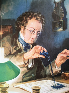
Here we have Schubert caught at the very moment he realises he has taken up the ink bottle instead of the sand box and has poured ink on his latest composition
 |
| Great Composers, book 2 |
– and here, fleeing the room when seized with acute shyness at the prospect of meeting Beethoven.
 |
| Great Composers, book 2 |

What other commissions did Martin particularly enjoy? I know that he had fun illustrating the comic poems about Dennis the Dragon and his illustrations for the Puddle Lane series have his wonted vivacity. He also enjoyed his collaboration with scientist Fred Hoyle and son Geoffrey Hoyle: the Science Fiction series in the 1980s.It’s a shame the Science Fiction series isn’t better known but in the mid-70s the directorship old-guard had retired, the Loughborough-based company had been sold to a large publishing conglomerate and the brand began to struggle for identity.
But when asked to select his favourite commission for Ladybird Martin would always choose “Gulliver’s travels”. If you ever get a chance to see the original artwork that he produced for this book then do. The reproduction in the books does not do it justice. The artwork combines humour, imagination, colour and verve – whilst respecting the traditions of a classic.
 |
| Gulliver's Travels |
This was Ladybird artwork of which he was justly proud, produced in 1976 – shortly after the retirement of his old friend Douglas Keen and as the company began to lose its way in the publishing world.
I first met Martin Aitchison over 10 years ago. I met him because he was a great Ladybird illustrator; we became friends because he was a lovely, gentle, funny, engaging man.
You could not fail to be struck by his lively, active mind and mischievous sense of humour. I really shall treasure my memories of our meetings; of talking over the past, of hearing his views of other artists, of giggling together like school-children over some trivial domestic incident.
He loved and was loved and died peacefully. Over the years I have heard from many artists and illustrators who say that his work was an inspiration. But for many, many more of us who grew up with Ladybird, he added colour, warmth and humour to the pictures of our childhood.
 |
| The Story of Metals (written by his father) |
 |
| Peter and Jane's teacher was posed for by Martin's wife, Dorothy |
The Magic Paintbrush and The Magic Stone (Stone Soup)

 I
couldn’t say how many childhood hours I spent on my stretch of the Cromford
Canal in Ambergate. Probably fewer than
I remember, but as time passes the important experiences seem to choose
themselves, and they’re hardly ever the ones that took the longest.
I
couldn’t say how many childhood hours I spent on my stretch of the Cromford
Canal in Ambergate. Probably fewer than
I remember, but as time passes the important experiences seem to choose
themselves, and they’re hardly ever the ones that took the longest. 


 Some of the local boys went fishing, but I
didn’t like the dark Amber water or the eddies where it joined the Derwent. I suppose I was younger than my years, as
well as shorter. When I started to go
there on the bus, the lads at school in Belper were interested in music, in
clothes and girls and football more than all the dreamy pleasures I would take
in my surroundings, the beautiful valley.
I couldn’t see it then, that I was different and rural, but now it’s all
over my memories of Belper and school.
So instead I think of the countryside, the holidays, the sunshine and
the herby smell of hay from the fields around our house. After the Chase Road bridge over the canal
you can walk for a little way along the towpath, looking over the broken walls
and fields to the River Amber and the viaduct.
Then you reach the place where the water just pours away, or at least
what overflows does, the canal itself isn’t flowing at all. You can walk around it, the path carries on
but the canal’s gone. They cut it all
away for the gas plant, my dad said.
That was where they used to put the smell in the stuff. Nobody ever believes me when I tell them
that. Halfway there a black metal bridge
over the water carries a great thick pipe from which a big drip would fall
every few seconds, washing the towpath back to its pebbled stone. As a lad I ran under it, or waited for the
drip and timed my walk. I think the pipe
takes water from the underground reservoir up beside the
woods. .
I loved the woods, the smell and sound and sight of them. It was like stepping into another of my
Ladybird books, or something by Enid Blyton.
Some of the local boys went fishing, but I
didn’t like the dark Amber water or the eddies where it joined the Derwent. I suppose I was younger than my years, as
well as shorter. When I started to go
there on the bus, the lads at school in Belper were interested in music, in
clothes and girls and football more than all the dreamy pleasures I would take
in my surroundings, the beautiful valley.
I couldn’t see it then, that I was different and rural, but now it’s all
over my memories of Belper and school.
So instead I think of the countryside, the holidays, the sunshine and
the herby smell of hay from the fields around our house. After the Chase Road bridge over the canal
you can walk for a little way along the towpath, looking over the broken walls
and fields to the River Amber and the viaduct.
Then you reach the place where the water just pours away, or at least
what overflows does, the canal itself isn’t flowing at all. You can walk around it, the path carries on
but the canal’s gone. They cut it all
away for the gas plant, my dad said.
That was where they used to put the smell in the stuff. Nobody ever believes me when I tell them
that. Halfway there a black metal bridge
over the water carries a great thick pipe from which a big drip would fall
every few seconds, washing the towpath back to its pebbled stone. As a lad I ran under it, or waited for the
drip and timed my walk. I think the pipe
takes water from the underground reservoir up beside the
woods. .
I loved the woods, the smell and sound and sight of them. It was like stepping into another of my
Ladybird books, or something by Enid Blyton. I met Suzanne at the Poly, where she was doing
Art. She lived in Nottingham and seemed
impossibly worldly to me. I couldn’t
believe she wanted anything to do with me, but I’m very happy that she
did. Those days seem a long time ago
now, but they made a difference, made me confident enough to get through life
pretty well.
I met Suzanne at the Poly, where she was doing
Art. She lived in Nottingham and seemed
impossibly worldly to me. I couldn’t
believe she wanted anything to do with me, but I’m very happy that she
did. Those days seem a long time ago
now, but they made a difference, made me confident enough to get through life
pretty well.


