Sunday, 29 May 2016

Why waste a good picture?

It's easy to get a bit sentimental over many of the golden-age Ladybird illustrators and lose sight of the fact that they were busy working people, just earning a crust.

For the most part, the artists don't seem to have been proud to be illustrating children's books.  From correspondence I've read, some at least were rather uncomfortable to be using their talents on such humble books instead of something more 'worthy'.

The schedule for book production was demanding - 24+ full page boards, crammed with detail, were required and there were a lot of books.  The editorial director kept a 'Keen' and educated eye on quality.

So it's quite interesting to look out for the short-cuts that the artists sometimes took to get through their workload.  Here are some that I've spotted, but please let me know if you find any others.


Before getting started, I should I'm NOT here talking about the many instances (see above) where the artwork was updated between editions of books - to correct a mistake or to move with the times.  This example from The Story of Ships (first pointed out to me by Paul Crampton).

For me this is also an interesting topic - but today's is a different story.


1) Same artist - different book

Here is Harry Wingfield making effective use of the set of sketches and photos that he took at a children's party to illustrate two different books: The Party and The Lord's Prayer (published in the same year)


The start of the books 'Knitting' and 'Crochet' began with the advice to wash hands - so why would Harry reinvent the wheel when a quick makeover can be performed?


A slightly more subtle example by Frank Humphris can be found in this picture of Alexander Selkirk, 'The Story of Pirates' and White Bird Canyon (The Story of Indians). 


John Berry's was also quite a subtle makeover in these pictures from The Policeman and The Roadmakers:

 2) Same artist, same book!

Slightly more daring was Berry's use of the same preparatory photograph  just a few pages along in the same book:


 I expect he felt that, with the regulation haircut and uniform, no one would notice.

But I think my favourite bit of creative recycling is this one:


3) Different artist, different book

 Here Martin Aitchison saves himself the effort of a visit to the hospital for a preparatory photograph when Peter and Jane's cousins visit someone in hospital.  Instead Martin 'visits' John Berry's book The Nurse, published a few years before.  And why not?


Monday, 2 May 2016

Ladybird Travel Adventure - your help needed

Introduction

A couple of weeks ago a journalist called Steve Clark got in touch.  He was thinking about writing an article about the real scenes captured in Ladybird Books.  Previously he had written a Ladybird-themed blog-post,  which I had shared on Twitter.

In Steve's blog post he had put side by side two pictures - one a photo of a village local to him which had been used as a basis to the front cover of the 1960s book 'The Little Red Hen'  and the other the picture from the book itself - a book beautifully illustrated by Robert Lumley.

The post attracted quite a lot of attention, as things often do that remind people of this much-loved series of children's books.  He wanted to turn it into an article for a Sunday paper - possibly the Mail on Sunday.  Now this is a topic that has interested me for a while.  I've been planning to write something on the topic and have been collecting pictures for this purpose for a while so I told him this.  However, in the spirit of Ladybird Land I agreed to help him with it and shared some of my information.

The story, due out 2 weeks ago, never appeared, he didn't contact me again and I assume that Steve changed his mind or, more likely perhaps, an editor was less enamored with the idea than either of us.

So now I shall share some of the scenes I have accumulated so far - mainly thanks to research and heavy use of Google Street view - but also thanks to contributions from some kind folk out there.

But I'd love to collect some more.  If you can place any well-known Ladybird scenes, I'd really appreciate your help.

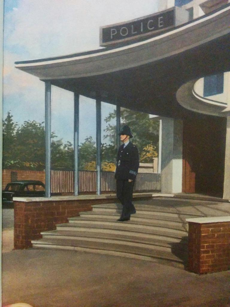
1)  John Berry's Police Station from the 1962 version of 'People at Work - The Policeman' and Brixton Police Station today


 via @lovesBrixton

The Wesleyan Methodist Chapel - adorned with cuddly Morris Traveller - from Robert Ayton's 1964 illustrations in 'Churches and Cathedrals' 


and today - now Bridport Arts Centre.

(Thanks to Gary Grant @ecoschemes)

3)Now on to London (John Berry again, 1961)

First we have The Royal Exchange in 1961:

(Apparently the flashy car in the foreground was John Berry's own - he squeezed a cameo of it into a few of his pictures)

And from Google: (very grateful to the bus for lining up so precisely).


The Science Museum, 1961 - hushed and tranquil


And today ... (ish)


Tower Bridge hasn't changed much of course, but the view behind it has.


(No, don't let the lean unsettle you; I don't think it's falling down in reality).


Some scenes have barely changed, of course:


The British Museum may have been completely revamped in some areas but others look much the same ...


I can't get quite the right picture of Piccadilly Circus - and not by night - but you get the idea.


London Zoo no longer seems to keep sea lions so the nearest I can get is the Penguin Pool


Though in my research I found the newspaper image that Berry seems to have based his painting on:
As for Heathrow,  ... (back in 1961 in was 'London Airport')


And today ...


4) But my favourite finds are still from fiction - there's an added buzz when a photograph hints that perhaps your five-year-old self wasn't wrong: perhaps after all it's all really really real and the ungrateful little gingerbread boy one day just might run past you ...


 And of course, let's not forget The Little Red Hen


Sunday, 6 March 2016

What's so special about ... John Berry (part 2)

(Part one is here)

As I said in my last post, the People at Work series was one of the first Ladybird series I remember.

The first 7 titles represent for me 'old Ladybird' - with a rather retro post-war comfort and solidity to them.  They show the grown-up world of work as a place of responsible adults, striving honestly to  make the world a safer or a more comfortable place for us all - particularly for children.   Nobody runs in this world - except the villains, and then the policeman (there are barely any policewomen) is forced to give chase.  But for the most part people walk placidly, or sit or stand.  All shall be well and all manner of thing shall be well in Ladybird Land.

 The policeman will catch the thief because that's what policemen do.  The fireman will put out the fire and the people will be safe. The nurse will look after the child and the child will soon be well again.  Even the battery farms are happy places, with contented hens (it says so in the text).

There a real sense of transition in the next batch of book that Berry illustrated in this series, all of which were issued in the late 1960s.  From The Postman to The Lifeboatmen this is very much a man's world.  In these books there are even fewer illustrations of women - not even as onlookers (with the notable exception of the workers in the potteries).

 In these books technology is very much to the fore and generally this is embraced with enthusiasm - particularly in the text.

The working world is still a noble place.  From the heavy industry of The Miner to the light industry of The Pottery Makers these are centuries-old trades, plied by workers much as they every have been - just with more buttons and levers.


The emphasis is on public service and great works. The three forces are covered in The Sailor, The Airman and The Soldier, all three men (just men) alert in their wholesome roles of peace-keepers and defenders.
Although they not actually in this series, the 3 books, also illustrated by Berry in a series called 'The Public Services,' really belong here - because of chronology and tone. (In case you've forgotten, the Public Services in question were Water, Gas and Electricity.  Remember now?  Seems a long time ago).

Basically, the late-60s is an exciting time to live - even if the colours are a little drab, a little dour at times compared to the earlier books.


The roads, freshly built by The Roadmakers are wide and smart and empty.  Daddy can drive his brand new Mini, crafted by 'The Carmakers', quickly down these roads, home to Mummy and a home powered by wonderful labour-saving devices.

The rapid rate of technological development is still a little disconcerting at times, but there are helpful men (always men) with neat partings and heavy glasses ever on hand to orientate us through it all.


There are pylons and power stations and maybe at times these are a little challenging in our mental and physical landscape.  But the pylons and power stations are not unharmonious; 
not without their own grandeur and grace.

(To be continued).


The 'People at Work' series, 606b, and 'Public Services', 606e, illustrated by John Berry and written by different authors - but mainly by I and J Havenhand