In some ways, the timing couldn't have been better.
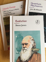
Just as everyone was talking about facts and alternative facts and the state of the world 'post-fact' - just when Trump draws our attention to climate change and the extent of creationist belief - Ladybird brings us The Expert Series:
These three titles are intended as the first in a new venture for the company Penguin Random House, which owns the Ladybird brand name. This is to be a series of books aimed at adults rather than children, "written by some of the leading lights and outstanding communicators in their field and published by one of the most trusted and and well-loved names in books", according to the preface.
In some ways, however, the timing could hardly have been worse.
This Christmas in particular there has been a veritable torrent of comedic vintage pastiche books in shops of different types, usually positioned near the till and jostling for our attention. Front of the queue has usually been the 'Ladybird Books for Grown Ups' whose success last year has been so remarkable.
Not many of us got through Christmas, I expect, without being a least witness to a Ladybird pastiche book being purchased or received. But no sooner has this flood begun to ebbb away, than (to continue my mixture of metaphors) more vintage-styled Ladybird Books appear near the till of bookshops, nudging at our elbows, asking to be picked up.
The danger for the publisher is that customers are likely to get a bit confused and/or a bit jaded with the vintage-pastiche concept, however well-realised.
 |
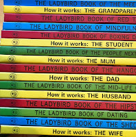
| Just some of the Ladybird pastiche books on sale |
So why did the publisher choose to embark on this venture now, especially given the fact that when these books were being prepared for publication there could have been no way of knowing how apposite would be the promotion of 'facts' and 'experts', of climate change, evolution and 'fake news'?
Why not let the dust of comedic pastiche settle a bit first before launching something new?
The children's book publisher that I celebrate on this blog was sold to a large conglomerate in the mid 1970s and the UK print works, with its offices and its history, were closed down at the end of last century. The Ladybird brand struggled for years for a decent market and a new identity, but with limited success. In recent years I would imagine that much of the brand's income has been derived from the intensive merchandising of 'vintage Ladybird' - tying in as it does with the popularity whole retro Cath Kidston-esque thing.
When the Ladybird Books for Grown Ups came along, their success took everyone by surprise. The books use irony and self-deprecating humour but the language, although updated for a 'grown-up' audience, generally stays true to the tone and language of the original children's books. Furthermore the writers by and large stuck to their decision only to re-purposing original Ladybird artwork in each book and not to edit or adapt it. And in doing so they made Ladybird cool again.
They made it ok for an adult to pick up a book that looks and feels like an old Ladybird Book and do something other than sigh and reminisce. Today the adult can pick the book up and smile or laugh or nod (or sneer or get a bit cross and put it down quickly). The name Ladybird on a book can now evoke curiosity, opinion or any grown-up response - and it's OK.
But the joke can't last forever. So now that Ladybird is relevant again, how best to use this momentum? The publisher has come to the only conclusion I think they could have done: take the idea of Ladybird Books for Grown Ups and make new books designed to educate and inform.
 |
| A lot of the illustrations have a rather faded, washed out look |
Choose properly grown-up, substantial topics and combine them with the format and brand-familiarity of a vintage Ladybird. The original format of a Ladybird Book requires 50 pages with the text starting on page 4 and each text page faced with a full-page, original colour illustration. Give a matt finish to the cover and a 1960s-style Ladybird logo and you should be able to combine the retro-appeal that first induced customers to pick up and flick through the pastiche books with a limitless list of possible future titles.
I don't know if these books will be successful but I hope they are and I've glad the company has tried this.
What about the problems? Well the first one is a bit paradoxical. The pastiche books did a very good job of aping the look of a late-60s early-70s Ladybird in every detail. They look and feel like the originals. So how do the Expert books capitalise on the success of the pastiche yet clearly distinguish themselves? How do the Expert books look like Ladybird Books without looking like the pastiche books, which have done a very good job of looking like Ladybird Books?
The conclusion the company has come to is to give the Expert books a white cover with a picture inset; to use coloured spines but using different colours to traditional Ladybird books; to use a 1960s style logo - but in monochrome. Will the books look sufficiently different that customers won't be disappointed by the lack of belly-laughs in the Quantum Mechanics one? I'm not sure. Are they sufficiently similar that customers will respond to the original vintage appeal? Again I'm not sure. But full-marks for thinking it all through.
Now what about the first three titles?
Firstly the format
The three books stay true to the classic Ladybird format of using one page of text faced by a full-page illustration and I'm glad that they have eschewed photography in favour of original illustrations. The illustrations aren't of the quality of Ladybird's 'golden age' but this would be a pretty tough ask as technology has moved on; in a world photography and digital design are at the centre of commercial illustration there isn't the large bank of graphic artists able to ply and hone their skills day-in-day-out. How could a Wingfield, a Berry or a Robinson thrive commercially today? Furthermore, traditional illustration is the more expensive option and there has to be a balance between quality and affordability. In short, the artists have done a pretty good job. What exactly is that job? In all the comment I have so far read on these books, the emphasis is very heavily on the 'expert' writers. But just as much space is occupied by the illustrations. In the traditional Ladybird Book the picture worked just as hard as the text in attracting, engaging and explaining information.
But in a book for adults, rather than for children, isn't all the space dedicated to illustrations just a waste? No, I don't think it is. If you want a book to be in the format of a vintage Ladybird Book then then illustration format isn't up for debate. Choose a different format and you might as well choose a different brand. Or not bother. The pictures, with a greater or lesser degree of success in these first 3 titles, still serve to engage the reader and to explain concepts. More importantly, I think, they break up the text into manageable chunks - all the more important for the eye of the modern reader who has become more accustomed to digesting content on-screen - and hence reading text broken up into small chunks with many graphics.
Next the content. This is what I think - for what it's worth.
The three books are actually very dissimilar.
I most enjoyed the Quantum Physics book. I like Jim Al Khalili as a presenter and it was the book I was most interested to read - perhaps because it was the subject I knew least about. The illustrations work well at time to clarify the text, at times to engage the attention before reading. I started to feel daunted by page 8 (ie the 3rd text page). I nearly gave up on page 14. For me this was not light reading. I ploughed on. It required all my attention and I often had to re-read passages several times. By the end I felt I'd had a mental workout but learnt a lot. It was well worth the effort and will help any future reading or (much more likely) viewing.
Evolution is a book by Steve Jones in Ladybird form. It is not a Ladybird Book, written by Steve Jones. By this I mean it has a very distinctive authorial tone, and is written in the first person, which is very 'unLadybird'. He is a lively and entertaining writer but I'm not sure why anyone would choose to buy this Steve Jones book, rather than another which would give him more room to do his thing. The fundamental concepts aren't hard to get your head round and if you choose not to believe in evolution, you would never buy this book anyway.
The same goes for the third book in the trio: Climate Change. Because it has been fronted by HRH it has attracted the most publicity. Much has been made of HRH's involvement and the rigorous process of peer review that it underwent pre-publication. The illustrator, Ruth Palmer, gets closest in this book to matching the 'golden-age' style of illustration (indeed illustrations in this book seem actually to be based more closely on vintage Ladybird original artwork, a fact acknowledged in the preface). But, pictures aside, I enjoyed this book the least. It was too bitty, too fragmented and, for all the right reasons, in tone it was trying too hard. I wonder if this was partly due to said same process of peer review. The book may have passed through too many hands and taken on-board too many comments. It didn't have a sense of progression and development. The most successful part was towards the end when positive initiatives were discussed.
 |
| Above: Ruth Palmer's new artwork based on Tunnicliffe's original |
 |
| The new artwork above the Frank Humpris original |
Will this new venture be a success for the publisher? I hope so. I think the Jim Al Khalili book in particular shows the potential for future titles - taking the 'trusted brand' of Ladybird Book and combining it with a very challenging subject. I think the move away in our lifetime from activities dependent on propositional thought has left something of a gap. The strict discipline of the Ladybird format means that concepts have to be pared down to their very essence without patronising. The pictures can help clarify these concepts for an adult readership becoming ever more graphically literate.
When I showed these books to some of my friends and asked if Climate Change and Evolution were such good topics, a couple of people insisted those topics would sell. "Schools will buy them - or parents will buy them for children". But ... but ... aren't these meant to be books for adults? Wouldn't it be ironic if it turns out that the main market is indeed the school market? This would be a strange reversal of the situation whereby vintage Ladybird Books in the 60s and 70s were often read on the sly by adults, looking for a basic introduction to a topic.
 |
| Ladybird Books of the 60s and 70s were often read by adults looking for an introduction to a topic |
As I finished this blog post (the longest I've ever written - sorry about that) I checked to see if any of these books had made it into the bestseller list.
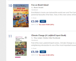
One was there - the one that had attracted the most publicity was at number 11 in the hardback chart.
And one place ahead, at number 10? Comedic pastiche: 'Five on Brexit Island'.


