Friday, 29 September 2017

How it works: the special stamp

Let's be honest, in this sad and sorry world, there's not a lot of work out there for a Ladybird book consultant.  But they say every dog has its day.  Sometimes a commission comes along that matches a niche interest as niche as mine.

It was in June last year (2016) that I received an email, telling me of the plans to issue a Ladybird Books set of stamps and asking if I would be consultant on the project.


Of course I said "Yes please". 

A long-list had already been drawn up of the categories that were to be featured on the stamps.  I was asked to suggest books that would fit those categories: favouring the most popular books but also representing titles from different periods.  They were also keen that the most well-known artists should each be represented.  Initially it hadn't been decided whether to feature only book covers or also inside pages.  Eventually the decision was made to use cover pictures only - I think  because the covers would have a greater resonance with a greater number of people.  At this point I suggested that more use be made of the spines of the books - and not only because of their uniform size and vivid colours.  Ladybird books are herd creatures - at their best when grouped together and it is sometimes the spines on the shelves of schools, libraries and shops that have made the deepest (if subconsious) impression on our memories.

As at every stage of this project, the painful bit was deciding what to leave out.  The other challenge was keeping quiet about it all; I had been sworn to absolute secrecy from the very first email, and this was sometimes frustrating.

A couple of months later, when a shortlist of contenders had been decided upon, (after numerous emails back-and-forth) I was asked to provide the books to be photographed and invited to attend the photoshoot.   So on the day in question I packed up smart copies of the selected books (and decided to add a few more, just-in-case)  put them in a small case and followed the instructions to get to a photography studio in South London.

A man was there, setting everything up for the shoot.  I've forgotten his name - I've forgotten the names of almost everyone I dealt with  - but he was nice and friendly and might have been John and I'm sure there was a Dean.  The design company was called 'True North'.


From my recent experience, it seems that a photography shoot requires a man (my experience suggests only men) to set up a  lot of equipment, arrange things and light things, make coffee, walk round and peer on screens and down cameras, nudge things and then make more coffee.  After about half an hour of this, another man will appear, introduce himself, make coffee, peer down cameras, give things a nudge, look at a screen or two, give things another nudge and then make more coffee.  The same interval will elapse before the third man appears and repeats exactly the same procedure as with the second man.  By the time there are four men, the photoshoot appears to be quorate - but the procedure remains the same.  After all four men have peered and nudged and drunk enough coffee it is lunchtime.


I had a very enjoyable morning learning how a photoshoot is conducted.  I also offered the occasional bit of advice (and was kindly told that my suggestions were 'invaluable') about the relative popularity of a book or an artist and what should be prominent - but for the most part I drank coffee.

Whether the procedure continued the same after lunch I can't honestly say (although I suspect it did) because I didn't think I could contribute any more and so I went home, leaving my books behind.  

I was then sent proofs of what I thought would be the final stamps - and liked them very much. The 'casual' arrangement of books - achieved through an inordinate number of nudges - (see picture below) had been tidied up to feature 4 stamps in each picture which spilled out beyond the stamp borders.  However, it turned out that there were still a number of other stages to be undergone and reviews by another couple of committees led to the decision to re-shoot in my absence.  If anyone doesn't like the final stamps (and I much preferred the more imaginative earlier version) this is where I have an opportunity to abnegate responsibility for the choices made.
From each 'stamp' at least one book was dropped, which rather undid the painstaking balance of artists and eras but with the intention of achieving a much more simple, less cluttered look.  Personally I preferred the cluttered look, but there you go.  If you like the final stamps best, forget I said that.


A couple of months later, in February this year, my books came home to me, packed up in my suitcase and travelling by courier.  I can confirm that no Ladybird books were harmed in the shooting of these stamps.  But since then  I've kept them in isolation from the rest of my books, thinking that I could auction off one or two of them for charity.

My next commission was to write the copy for the presentation packs that accompany the first-day covers and general background bumf.  It had been decided to create a Ladybird ABC of snippets of information about the history, vintage books and artists.  This immediately struck me as a very clever and appropriate idea and take my hat off to whoever suggested it.  My first task with this stage of was enjoyable - to try to think of a suitable topic A-Z, giving a flavour of the vintage Ladybird story.  If coming up with a category for each letter was a pleasure, trying to say what I wanted to say within a super-strict word-count was extremely frustrating.  The attention to detail shown by the project editor was impressive.  Clearly you would need to be exceedingly punctilious when you're dealing with experts and with stamp collectors and when publishing something with this sort of reach - but Helen (another one) was both meticulous and flexible. 

A final piece of copy was required for the Royal Mail Yearbook - a publication I didn't previously know about.  This book (published, as you might have guessed, annually) contains a chapter of further information about each topic featured on that year's stamp issue.  After all the limitations and restrictions of the previous tasks, a bit of free-flowing prose - a chapter on the history of Ladybird Books - was again a pleasure to write.

But the best bit for me was probably the photoshoot for the Yearbook chapter.  The initial 'place-holder'  idea was to feature a large shot of a shelf of books perhaps in black and white - with some elements from the Ladybird story featured in colour.  Because my collection is unusually extensive and because I have a good idea of what features of the Ladybird story are worth highlighting, I had offered to let the photographers take pictures of particular books or artifacts at my house.  But when the designer saw a picture of my book-shed, they asked if they could photograph there.


By now I was experienced in Royal Mail photoshoots and was prepared for the men who arrived in stages, for the screens, the peering, the nudging and the need for regular refreshments; the Yearbook team, did not disappoint.

On arrival they all admired my book-shed and then decided to dismantle almost everything.  Together we pulled most of the contents into the garden (it was a hot dry day and again no books were harmed in the creative process) gave it all a stir and then put it all back again in almost exactly the same position as it had been to start with.  Then the photoshoot got underway, following the now-familiar process.


Everyone involved was very nice and friendly and the fact that I've forgotten everyone's name (there was a Gary) is no reflection on them or my enjoyment of the whole day.

This time, however, there was a clear end to the photoshoot.  They packed up the equipment and we went to the pub and then they went home.

After that, it was just a question of dealing with questions by email or phone.  This went on over an extended period and even required me to do a bit of research when on holiday in China - quite a challenge on a mobile phone, with limited wi-fi and the Great Firewall of China preventing access to Google.

 I know there is a small mistake in the graphics of the presentation pack that I picked up but that was never corrected.   I say no more.


The stamps came out on Thursday 14th September 2017.  The yearbook (with the shed-shoot) won't be out for a little while yet.

Every dog has its day -  but the 14th of September was not one of unalloyed joy.
Disappointingly, the press release - disseminated widely online and in the national papers - made extensive use of my copy but no use at all of my name.  I received no acknowledgement for the loan of my resources or involvement beyond the 'words'.

It turns out that this was an oversight.  Now forgive me for this, but I would like to put it in writing, if only on my own blog, these words from an email I have just received from a manager at the Royal Mail, regretting that the stamps and ephemera do not include "a reference to your invaluable contribution to the stamp designs."  The message ends "All I can do is to offer my apologies."

Pazienza.  It was a pleaure and a privilege to be involved.

And now you know How-it-Works,  I hope you'll go out and buy some of this lovely collection:

http://shop.royalmail.com/icat/ladybird-books/icat/ladybirdbooks

Saturday, 29 July 2017

Top ten mistakes that booksellers make when selling Ladybird Books

This post is probably a bit niche - it's intended for people who ever buy or sell vintage Ladybird books

There are lots of traps that make the buying and selling of Ladybird books a bit different from other children's books, and which can lead even experienced sellers to describe their wares incorrectly.  I'm writing this post from my experience over the years of buying books and talking to sellers.  I hope it will help some small-time traders, collectors and charities get it right.


Number 10

Assuming that old Ladybird books are the most valuable.


There are lots of Ladybird book collectors out there - but the vast majority of those who buy have only a mild case of nostalgia and the wish to recapture a bit of childhood (perhaps to share with the next generation or two).  The books that seem to have had the biggest impact in this way tend to be fiction rather than non-fiction.  Also the non-fiction met the school market -so perhaps there are more around today?  Anyway, that's why a beautiful early edition of British Birds and their Nests from 1953 may be much harder to sell than a 1980s reprint of Little Red Riding Hood.

Number 9

Assuming that a loft-find of vintage Ladybird books will make a small fortune.  


Between the late 50s and 1980s the company was phenomenally successful - which means that print runs were huge.  In turn this means that there are still lots of copies around of most books of this era.  The Bible stories of series 522 and 606x, for example, were printed with schools and Sunday Schools in mind, were often given as prizes for good conduct and consequently are often found in large numbers and in pristine condition today.  They don't seem to have got much use! 

Number 8

Assuming books with an author's signature have been signed by the author


In some series of Ladybird books it was the custom to reproduce the artist's signature on the dust-wrapper or preliminary pages.  This was a style feature - not intended to fool anyone.  But so often that's what happens.  Look out for printed signature on books by:
Gilda Lund
Vesey-Fitzgerald
Max Kester
Auntie Muriel (Muriel Levy)


Number 7

The sticky price label.  


Sticky price labels are a massive NO for Ladybird dust-wrappers and matt covers which simply aren't as robust as later laminated covers or later dust-wrappers found on children's books today. Stickers are likely to scar the book..  Light pencil or a post-it-note-type sticker on the preliminaries work best.

Number 6

Assuming misprinted or misbound books are valuable.


Re the massive print-runs mentioned above,  lots of mistakes seem to have been made.  If you find a misbound book, it may be of mild interest as a curiosity to a collector but more often it will disappoint the buyer.  There are lots of such books out there.

(That said, I'm rather fond of this particularly bonkers example and keep it in my collection: it's a mash-up of Peter and Jane, Rapunzel, Arms and Armour)


Number 5

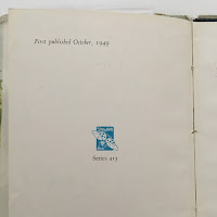
Assuming that any book marked 'First Edition' must be more sought-after.  This may well be true if the book is pre-1960s and the information looks like this.

But if the book dates from the 80s or later and the information looks like this: then the words are pretty well meaningless.

Number 4

Apologising for a missing DJ  on a vintage Ladybird Book


If the book was first published after 1965 it would never have had a dust wrapper.  Nothing to excuse.

But then, conversely ...

Number 4b

Assuming that a book with full-page colour boards never had a dustwrapper.  


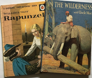
Some early series books originally had colour boards underneath a dust-wrapper.  These series include Uncle Mac, Series 413, series 474 and The Impatient Horse.  It's quite simple: any book that was issued before 1964 will originally have had a dust-wrapper.
This copy of Rapunzel dates from 1968 so never had a dj.  In the Wilderness dates from 1948 so it has lots its original dj

Number 3

Assuming that books with the same name will essentially be the same book.


Even when the book has the same title and is published in the same series, it might be a very different book from the one a buyer is expecting.  The safest things is to cite both artist and illustrator (but see Number 1 below).  Pictured is an example of the sort or thing that regularly catches buyers out - but there are lots more.  More information here.

Same title, same series - but someone hoping to buy the book on the left would probably be unhappy to receive the one on the right.

Number 2

Overlooking obvious clues as to the publication date.  


Any book with an original price on the back in decimal currency must post-date decimilisation (1971).  Any book with a bar code will be from 1982 onwards etc.  Why would an experienced seller overlook such obvious clues?  Because of 'Number 1' ...

Number 1

Assuming that the date printed in the front of a Ladybird Book is the date it was issued.  

Although this book is dated 1964, it was printed over 12 years later

Who knows how many buyers have bought books online only to find that a book is a later edition and not the 'first edition' it was described as?  Whilst for most books, the latest date mentioned on the preliminary pages indicates the date of that particular edition, this is rarely true for Ladybird Books from the late 1950s onwards.  Instead the routine was to put on the title page the date of the first edition, regardless how long ago it was that that first edition appeared; regardless even of the fact that the book might have been revised extensively in the the intervening years.

Both versions contain only one date: 1962 - but were issued a decade apart

There are a few more I could add - but 10 is such a neat number.  Hope this is some help.


Saturday, 3 June 2017

Ladybird Experts: Battle of Britain and Shackleton

In common with Basil Fawlty, golden-age Ladybird books try not to mention the war.

Back in 1941 Puffin Picture Books published a book on the Battle of Britain.  It also contained beautifully stylish and evocative illustrations

This to some extent reflects the spirit of the age - of the 1950s to 70s -  to look forward, not backwards, towards a constructive, technology-driven future.  But probably a bigger influence was the perspective of Ladybird's editorial director, Douglas Keen.  As a humanist and a pacifist he was reluctant for the books he commissioned to dwell on 20th century warfare - and certainly not to glorify it.
The new Ladybird Expert books

This is a matter I discussed in a post I wrote three years ago: "What to Look for in Vain"

In the post I discuss the topics that Ladybird, rather surprisingly, never covered.  Now that Penguin-Random House have bought out their new Ladybird Expert series, it will be interesting to see how many of these gaps are eventually closed. For these reasons I was particularly looking forward to reading the latest  Penguin-RH publications: The Battle of Britain, by James Holland, illustrated by Keith Burns; and Shackleton by Ben Saunders, illustrated by Rowan Clifford.

I read them both this weekend - and I was not disappointed.

Let me start with The Battle of Britain.  The premise of these new Expert books is to take topics that adults will be interested in finding out a little more about and to present the content 'old-school'.  The small size and traditional layout of a Ladybird doesn't just lend itself to children's reading material but also for all of us who want more than bite-size information but less than a traditional book or densely packed website.  For me the format works really well (and I talk a lot more about the format and concept here).

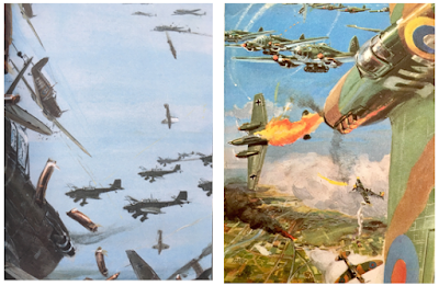
Left: new artwork by Keith Burns. Right: a rare WW2 illustration by Frank Hampson, 1968

The Battle of Britain is a topic I felt I didn't know enough about.  I've picked up bits from school, from old films, from Biggles (!) and from the odd documentary.  This book collated the odds-and-ends in my head, sorted them out, added new stuff,  gave the whole lot a context and then sent me on my way.  It was an excellent read.  Really very good.  For different reasons it stands with 'Quantum Mechanics' as my favourite so far.

The first thing I have to single out is the artwork.  Keith Burns' artwork is simply wonderful.  Although not exactly vintage Ladybird in brush-stroke, it is vintage Ladybird in spirit.  It does what the best LB artwork always did: it takes at least its fair share of the story-telling.


I'm not a historian - except perhaps of Ladybird - so I can't really comment much on the accuracy and originality of the content.  But it seems to me that writer James Holland manages well the need to spin a thrilling yarn with the need to give a balanced account.  Now when golden-age Ladybird history writer L. du Garde Peach was recounting most of the  original 'History series' books he was writing at a time when history for children was more closely related to story-telling than it was to history for adults.  It was thought that engaging a child's imagination was more important than absolute historical accuracy (and thinking of all the 'proper' historians today who ascribe early inspiration to this series of books, I feel this may be a good point).

Be that as it may, I can imagine that when writing for children or adults today there is pressure to represent a balance of view-points - an imperative which rarely got in the way of Capt. WE Johns or L du Garde Peach.  One of the ways that Holland does this is by weaving in extracts of testimony from pilots on both sides of the conflict.  He also sacrifices the (surely tempting)  'plot device' of stressing how close Britian came to losing the conflict.  Indeed, it seems to me that he makes a point of the difficulties inherent in the German offensive and reminds the reader to see beyond the idea of the plucky little island holding out against overwhelming odds.

And this is where I come back to the artwork sharing the story-telling.  Whilst the writer restrains from over-playing the drama, the artist brings all the thrills and exhilaration and colour he can to animate the tale.  The writer quotes first-hand testimony from pilots; the artist sweeps you up in the air, sends you soaring and then drops you in a spin, makes you almost sea-sick on the high seas and scorches you in the fires.  Whilst writer Holland avoids a glib ending to the conflict and reminds us that the war, at this point, was only just beginning, it's left to the artist to tell the story of a homecoming, a grateful people and, if you like, a happy ending, all in one last stirring picture:


As I've sometimes remarked before, Douglas Keen possessed a remarkable skill in matching writer and artist to commission.  On his occasion Penguin-Random House have done the same thing very well indeed.

Rowan Clifford, Shackleton, 2017

John Kenney, Captain Scott, 1963
I have less to say about Shackleton, by Ben Saunders, illustrated by Rowan Clifford.  I enjoyed it.  It filled in the details on an episode about which I didn't really know much.  But I didn't love it.  Why not?  The story is well told, with the Ladybird touch to the prose - simple but intelligent.
The artwork is skillful but I think the problem is that the artwork doesn't pull its weight in the story-telling.  The pictures often seem to be there to take up their allocated space, not to advance or add depth to the story.  The whole book, probably unfairly, suffers by direct comparison with the vintage  Ladybird classic Captain Scott.  In 'Shackleton' I miss the light and energy of Kenney's original artwork.  As Shackleton's party were often short of light and energy themselves in the Antarctic winter, you might say that the artist captured a truth - but this doesn't enhance the pleasure of the reader.


Where the artwork is most successful, as in the following pictures, it draws you into the scene and adds depth to the text.


Sometimes, however, it  did less than it could have done to help me empathise with the characters' ordeal or to add structure to the story-telling.


A few final points
1) I started this post talking about the gaps in the topics covered by vintage Ladybird.  One of the biggest gaps in the history books particularly is the lack of coverage of women: female figures and women's achievements get very little coverage.  Times have changed a lot since Keen was commissioning new books but I'm surprised Penguin-Random House chose not to ring these changes from the start but instead reached for the safest of Boys Own topics.  Ok.  It's not a problem, as long as they get their act together quickly.  With this in mind, my top suggestions for history books would be:

  • Ada Lovelace
  • Life and times of Jane Austen - yes a quiet domestic life but what turbulent times she lived in! most of which find echos in her books.  Plus the bicentenary of her death is coming up fast.
  • Female aviation pioneers
  • The Suffragettes
  • The Brontes 
  • The Empire - perhaps an attempt at an honest look at Britain's imperial past 
Other ideas for books? Perhaps you could suggest them below.

2) I hope, going forward, Penguin RH think hard about matching artist with commission.  When they find the right artist, one capable of sharing the story-telling with the writer, I feel they should give that artist equal billing.  Although the names of the creators are never on the cover of a vintage Ladybird Book, on the title page artist and writer, quite rightly,  share the credit equally.

Artwork was at the heart of vintage Ladybird success and for this new project to flourish longer term the same needs to be true today.

3) Quibbles aside, the books are excellent.  Hope you enjoy them too.


Monday, 13 March 2017

New Ladybird gallery


Last Friday (10th March) saw the official opening of the Museum of English Rural Life, (MERL for short) Ladybird Books gallery.  This was my second visit to the museum but I thought I should wait until after the official opening to offer readers of this blog a review.


What is the MERL and what has it got to do with Ladybird Books?   

When the Ladybird Books factory and offices in Loughborough were closed down in 1999, numerous boxes of original Ladybird artwork were moved to London where they sat neglected in a dark corner for a number of years.  Not all of the Ladybird artwork was in those boxes – but a great deal was.  Eventually staff at Penguin sought a new home for this artwork and the University of Reading agreed to take it as one of their ‘Special Collections’.  The artwork was still tucked away from general view in an archive - but now in Reading rather than London – and now at least it could be viewed on request.

However, from time to time items from the archive would be loaned to exhibitions and recent extremely successful such exhibitions (notably the one at Bexhill and The House of Illustration in London 2015) made apparent the ‘pulling-power’ of Ladybird.   

Space was found for a dedicated and permanent Ladybird gallery within the MERL.  And so it is this permanent Ladybird space that is being opened and celebrated.   


So what will you see if you decide to visit?

The Ladybird gallery is small and awkwardly shaped so the organisers have had to be quite creative in planning how best to use the space.  There are two walls of dedicated space and currently a large proportion of this is taken up with a cabinet featuring the brand new Penguin Random House ‘Ladybird Expert” artwork.

There are perhaps 10 more pieces of original vintage Ladybird artwork on the walls, a small number of other artefacts including an uncut sheet and a couple of information plaques.  The most dominant feature of the gallery is the colourful “Wall of Books” – which to anyone who didn’t get to see the exhibition at Bexhill or the House of Illustration will certainly enjoy viewing.


If you have a cursory interest in Ladybird Books then this gallery will add to your enjoyment of a very interesting museum.

Now if you are aware of this event at all it may be because of the recent publicity that the Museum has successfully generated.  This is a good thing. 
 In my opinion the not-so-good thing is the tendency towards exaggeration that characterises a number of the reports about the gallery.

Earlier this month The Guardian declared in a headline that an:
“Entire art gallery of Ladybird book covers is world first”

“You can view an entire art gallery of Ladybird Book covers at a museum in the UK”

The University of Reading’s own press release tells us that this will be:
 “the first and only permanent exhibition of Ladybird Books artwork”

Now I am sure the MERL is blameless in all this reporting but some of this is a little misleading and unhelpful.

1) This is not the first permanent exhibition of Ladybird Books.  The Charnwoood Musum in Loughborough, home of Ladybird, established a nice little permanent exhibition back in 2015.  I believe too that their collection includes at least one piece of original Ladybird artwork.   I phoned recently to check that the exhibition was indeed ‘permanent’ and it is.

2) The Guardian has got confused between artwork and book covers. 

3) The term ‘an entire art gallery’ implies a dedicated building or wing.  That’s not what you’ll find.

Now  for my thoughts on what I saw.

 a) The MERL makes a great visit.  The rural life museum has something for everyone – even if old ploughs aren’t your thing then something else will be.  It is bright and airy and well-displayed and not too big.  It also has those indispensable assets: a cafĂ© and a shop.

b) All the people that I have met at the MERL are friendly, helpful and dedicated.

c) The Ladybird gallery has lots of potential and is a good start.  It will add to the enjoyment of many museum visitors.

d) It needs to articulate a little better to the casual visitor quite why there is a Ladybird Books gallery nestling among the ploughs and butter churns.

e) It needs, in my opinion, to make MUCH more use of the original artwork, and in the future I hope it will.  With thousands of pieces being kept in storage it is more than a shame to have so few on display.  There are quite a few poster-sized reproductions of the artwork.  Why use precious space with a few reproductions when your USP is that you have access to masses of original artwork?  Even allowing for the challenges of space there are countless other ways to exploit the archive that is the raison d'ĂȘtre of this gallery and to put on public view material that will bring pleasure to the many people who remember the books.

So all in all, a promising start.

If you visit Reading I'd recommend you visit the MERL and I hope you drop in to the Ladybird gallery.  I’d like to hear what you think.